Dashboards
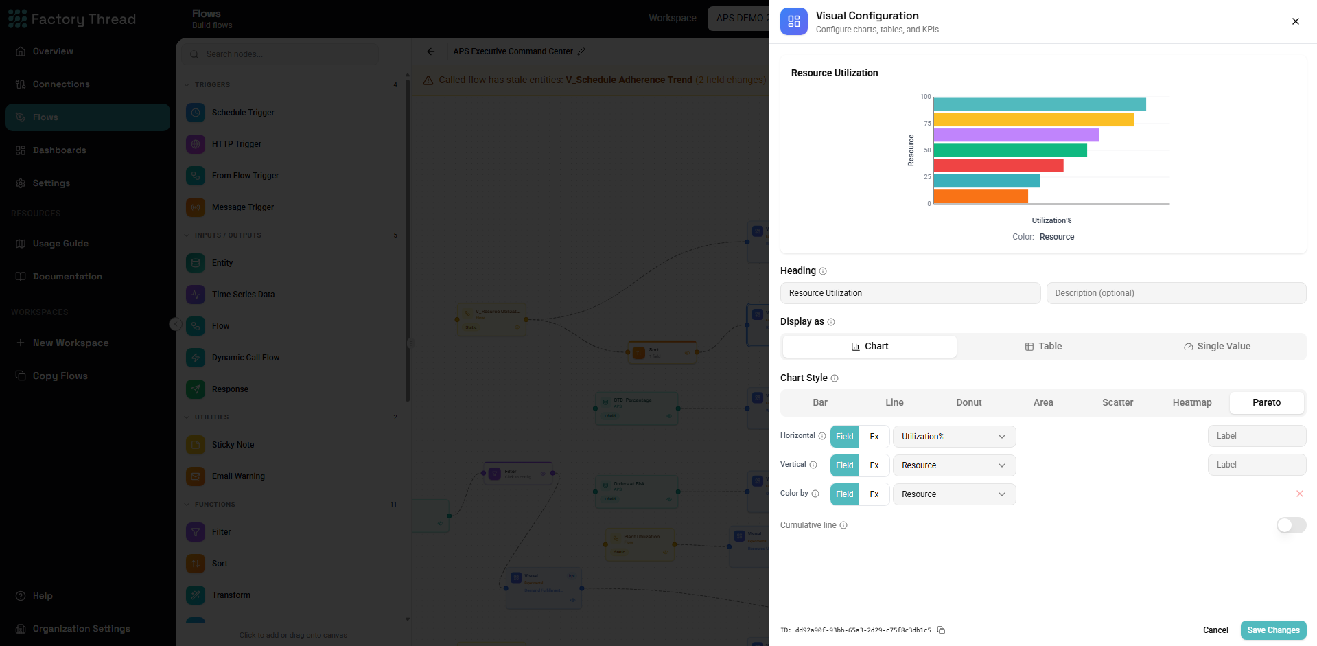
A dashboard turns a Flow's data into charts, tables, and KPIs. You build it by adding dashboard nodes to a Flow, then publish it as a page you — and the people you share it with — can view. A dashboard exposes only its rendered output: viewers never see the underlying Flow, connections, or queries.
The dashboard nodes
There are three nodes, all in the dashboards section of the Element Panel:
| Node | Label | Purpose |
|---|---|---|
| Dashboard | "Visual" | Renders one visualization (a chart, table, or KPI) |
| Dashboard Layout | "Dashboard" | Arranges several visuals into one grid page |
| Dashboard Filter | "Dashboard Filter" | Adds an interactive filter control |
A simple dashboard is one Visual node fed by your data. A richer one wires several Visuals into a Layout and adds Filters.
Visual types
A Visual node renders exactly one of:
Charts
Rendered with Vega-Lite. Choose a chart type:
- Bar, Line, Area, Point (scatter)
- Donut
- Heatmap
- Pareto — a sorted bar chart with an optional cumulative-percentage line
You bind the chart's encoding channels (x, y, color, and so on) to your
data. A channel can be a plain field or an aggregate expression — the
dashboard aggregates at view time, so SUM(revenue) or SUM(profit) / SUM(revenue) work directly, grouped by the chart's non-aggregated channels.
Expressions use the same expression language
as the rest of the Designer.
Tables
A paginated table with sortable columns, custom column labels, and number/date formatting.
KPIs
A single headline number — SUM(revenue), SUM(profit) / SUM(revenue),
LAST(status) — shown as a number, text, or gauge, with optional thresholds.
Conditional formatting
Charts, tables, and KPIs support conditional formatting rules — color a cell, row, or value by comparison (greater-than, between, equals, …) with intent colors (danger, warning, success, …).
Filters
A Dashboard Filter node adds an interactive control to the published dashboard. Four control types are available:
- Dropdown (optionally multi-select)
- Date range — absolute dates or relative presets (today, last 7 days, …)
- Text search
- Range slider — for numeric columns
FactoryThread suggests the right control for a column's type. To pre-scope the data before it ever reaches the dashboard, add an upstream Filter node instead.
Layout
A Dashboard Layout node combines several connected Visual nodes into one published page, arranged in rows and columns. FactoryThread auto-sizes the grid sensibly — KPIs sit several to a row, charts two to a row, tables full-width — so a tidy page falls out without manual placement.
Real-time dashboards
A dashboard can run in real-time mode, updating live as new data arrives (for example from a streaming source) rather than only when the page loads.
Drill-through
A published dashboard supports drill-through — click a chart mark, table row, or KPI to open the detailed records behind that value, so viewers can move from the summary straight to the underlying rows without leaving the dashboard.
Publishing and sharing
You make a dashboard available by publishing its Flow. Once published, the dashboard can be shared with specific people or teams as a view-only surface. See Publishing & Sharing Dashboards.
Next steps
- Publishing & Sharing Dashboards — make a dashboard available to others
- Expression Language — aggregates and computed encodings
- Building Flows — build and publish the Flow behind a dashboard